Understanding Color Fundamentals
Color is more than what meets the eye—it’s a powerful tool for storytelling and emotional communication. Before diving into Color Grading techniques, we need to understand the building blocks that make up every color in our images.
The Four Pillars of Color
Hue
Hue is the actual color you’re working with—the pure essence of red, blue, green, orange, and so on. It’s what we typically mean when we say “color.” Think of hue as the position on the Color Wheel, representing the fundamental wavelength of light that defines whether something is red, blue, or any other color.
Saturation
Saturation measures the purity and intensity of a color. At full saturation, colors are vibrant and bold—imagine a brilliant sunset or a field of wildflowers. As you desaturate a color, it becomes muted, eventually turning to gray. Saturation is your tool for controlling how intense or subdued your Visual Storytelling becomes.
Key insight: Highly saturated images feel energetic and attention-grabbing, while desaturated images often convey moodiness, nostalgia, or sophistication.
Luminance
Luminance refers to the brightness or darkness of a color. Here’s where it gets interesting: less luminance makes colors appear more saturated and adds black to the mix, creating deeper, richer tones. Conversely, adding luminance introduces white, making colors lighter and more pastel-like.
This is crucial for Photo Editing because luminance affects not just brightness, but also the perceived weight and depth of colors in your composition.
Temperature
Temperature describes how warm or cool colors appear. Warm colors (reds, oranges, yellows) evoke feelings of energy, passion, and comfort. Cool colors (blues, greens, purples) suggest calmness, distance, or melancholy. Understanding Color Temperature is essential for creating the right mood in your work.
The Power of Independent Control
One of the most powerful aspects of modern Photo Editing software is that we can independently edit hue, saturation, luminance, and temperature for every single color in an image. This level of control allows for surgical precision in your Color Grading workflow.
Color Models and Spaces
RGB: The Foundation of Digital Color
RGB is the additive color model that forms the basis of all digital images. By mixing red, green, and blue light in different proportions, we can create virtually any color visible to the human eye.
Understanding Color Spaces
Within the RGB model, different color spaces define the range of colors available:
- sRGB (Standard RGB): The most common color space, designed for web and general screen display. It’s the “universal language” of digital color that works across all devices.
- Adobe RGB: A wider color space that captures more vibrant colors, particularly in the cyan-green range. However, it’s not designed for all screens—images in Adobe RGB may appear dull on standard displays unless properly converted. Use Adobe RGB when shooting for print or when you need maximum color fidelity in your Professional Photography workflow.
Pro tip: Always check which color space you’re working in, especially when preparing images for different outputs (web vs. print).
The Psychology of Color
Colors aren’t just visual elements—they’re emotional triggers that can dramatically affect how viewers perceive and feel about your work. Understanding Color Psychology transforms you from someone who edits colors to someone who crafts emotional experiences.
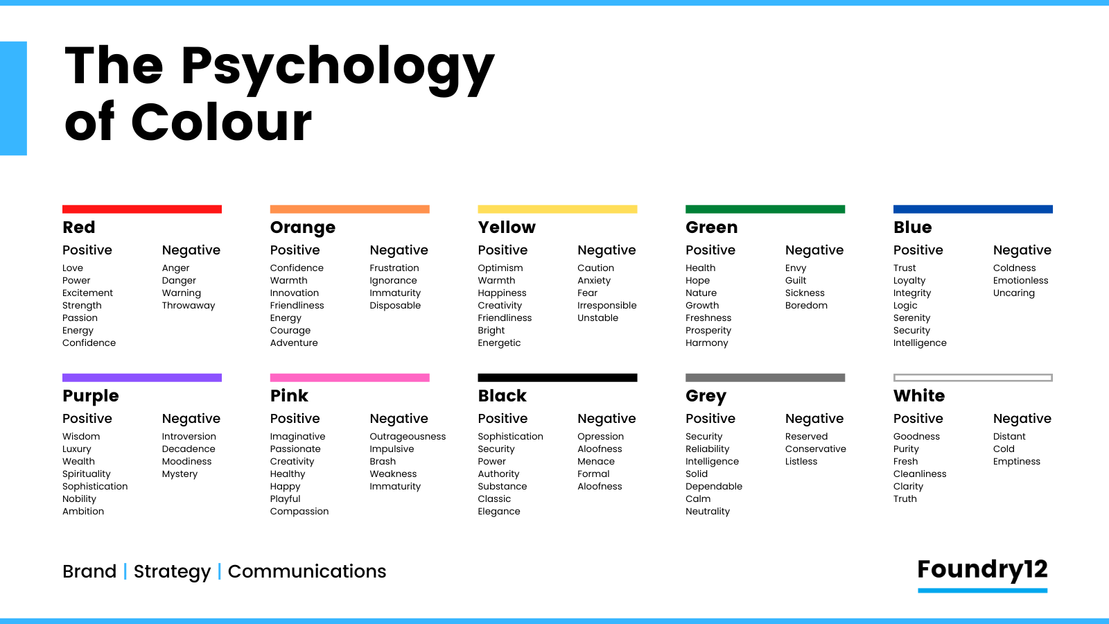
Each color carries cultural and psychological associations:
- Red: Passion, energy, danger, urgency
- Blue: Trust, calmness, sadness, professionalism
- Yellow: Happiness, optimism, caution
- Green: Nature, growth, harmony, freshness
- Orange: Enthusiasm, creativity, warmth
- Purple: Luxury, spirituality, mystery
The key is using these associations intentionally in your Visual Storytelling to reinforce your narrative.
Color Harmony: Creating Visual Balance
Certain color combinations naturally please the eye. These color harmony principles, rooted in both nature and art theory, give you frameworks for creating cohesive, professional-looking images.
Analogous Color Schemes
Analogous colors are three or more hues positioned next to each other on the Color Wheel, equally fanned out from a middle color. For example: yellow, yellow-orange, and orange, or blue, blue-green, and green.
Why it works: These combinations feel natural and harmonious because they’re found everywhere in nature—sunsets blending orange into red and purple, ocean scenes flowing from blue to blue-green to teal, forests displaying various shades of green.
When to use: Analogous schemes create a sense of unity and cohesion. They’re perfect for images where you want a smooth, comfortable viewing experience without jarring contrasts. Think peaceful landscapes, intimate portraits, or contemplative scenes.
Monochromatic Color Schemes
Monochromatic schemes use a single hue with varying ranges of saturation and luminance. You might use different shades, tints, and tones of blue, for instance—from navy to sky blue to pale powder blue.
Found in nature: Think of the many shades of orange, pink, and purple in a sunset, the deep to light blues during Blue Hour, or the varied greens of a forest canopy. The ocean at different depths shows monochromatic variation from deep navy to light turquoise.
When to use: Monochromatic grading is incredibly powerful for evoking specific emotions and honing in on the Color Psychology of a single hue. A predominantly blue image feels cool and melancholic; an orange-toned image feels warm and nostalgic. This approach helps you really lean into the emotional quality of your chosen color.
Complementary Color Schemes
Complementary colors sit opposite each other on the Color Wheel—red and cyan, orange and teal, yellow and purple. These pairings create the highest contrast and visual interest.
Why it works: Complementary colors are somewhat naturally occurring in different environmental conditions. The famous orange and teal look in Cinematic Color Grading mimics the contrast between warm tungsten light (orange) and cool shadows or sky (teal).
When to use: Complementary colors introduce dynamic tension and make your subjects pop. They’re visually arresting and create depth by pushing warm tones forward and cool tones back. This is why Hollywood loves orange and teal—it naturally separates skin tones (warm) from backgrounds (cool).
Remember: You don’t need to use these schemes at full intensity. Subtle applications of color harmony often work better than aggressive grading.
Practical Application: The Editing Workflow
Now that you understand the theory, let’s translate it into actionable editing techniques.
Start with a Question
Before touching any sliders, ask yourself: “How do I want my photos to feel? How can I manipulate the colors to tell the story?”
This question should guide every color decision you make. Are you creating a warm, nostalgic memory? A cool, isolated mood? A vibrant, energetic scene? Let the emotional goal drive your technical choices.
The Color Grading Panel
The Color Grading panel is your primary tool for adding colors into specific tonal ranges of your image:
- Shadows: Add color to the darkest parts of your image
- Midtones: Adjust the middle tones where most of your subject detail lives
- Highlights: Color the brightest areas Advanced technique: You can target very specific colors within certain areas of the image by combining tonal adjustments with precise hue targeting. For example, you might add warmth only to the yellow highlights (like sun-lit areas) while keeping other highlights neutral.
Masking Tools: Surgical Precision
Masking tools give you granular creative control over colors within specific areas of your image. This is where your color work evolves from global adjustments to targeted artistry.
Color Range Masks
Color range masks combined with temperature, tint, saturation, and luminance adjustments let you target specific colors in your image with surgical precision.
Example workflow:
- Create a color range mask selecting all the blues in your image
- Adjust only those blues—shift their hue slightly toward cyan, reduce their saturation for a muted look, or darken their luminance for more drama
- The rest of your image remains untouched
Real-world application: In a beach portrait, you could select just the ocean blues and shift them toward teal while making them slightly more vibrant, creating that sought-after tropical look without affecting skin tones or other colors.
Linked Map of Contexts